(Kelly Sikkema/Unsplash)
One of the things about the process of creation that I’ve never really understood is the tendency for creative people to hide what they’re doing until the moment of release, in part out of a desire to maximize coverage or a launch of some kind.
I think there are sometimes cases where, sure, maybe that makes sense. But I like the idea of building in public and saying that you’re doing something out in the open, because it makes the process a whole lot more transparent.
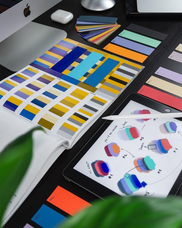
As I’ve built a lot of my sites over the years, like Tedium or ShortFormBlog, I tend to put a lot of work into design, because I see it as a differentiator and a way to tell a story about the decisions I’m making.
With the site that is going to replace MidRange, I am going to do just that. Warning: Some of this stuff is rough and may change. I’m creating in public, and letting the chips fall where they may.
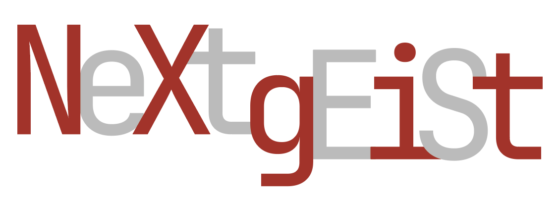
First off, what am I calling it? The name will be NextGeist, which is a play on the German term zeitgeist, a concept referring to the “spirit of the age.” I am admittedly Americanizing the term somewhat by mixing English and German together but I think the result will be flexible enough to roll with the punches. This newsletter/platform will, at least at launch, focus on the evolution of the fediverse and related social networks, like Post, from a cultural standpoint. The guiding mission is to bring back the early vibe of Mashable and ReadWriteWeb, two sites closely associated with the growth of the Web 2.0 era, to whatever is happening in the world of social media right now. I don’t know if it has a name yet, but I am going with “post-viral” for now.
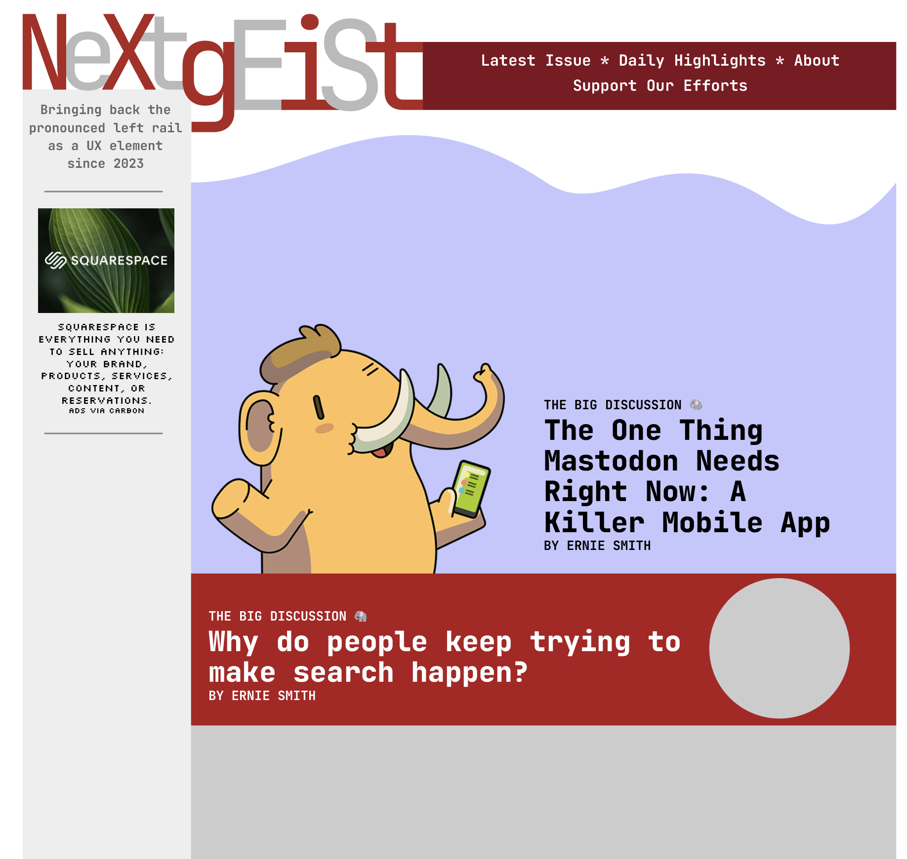
Now, let’s talk about visuals. Simply, I want something that feels like it’s a modern take on a tech outlet from the late ’90s or early 2000s. I’m using a lot of monospaced fonts for this, as that’s a style that is often associated with early technology sites. The primary font I have chosen, JetBrains Mono, is developed by a software company, and it has a bit of a throwback style, reminiscent of a combination of Courier New and, say, Trade Gothic Bold Condensed #20.
I’m also planning to use using Silkscreen as a secondary font, basically for no other reason than that it is an iconic font among vintage web designers, originally developed by Jason Kottke and becoming as hated in some circles as Hobo or Comic Sans. We don’t need Silkscreen anymore—it is a font that exists because web developers needed a font at that time that could be easily readable in small sizes. I am choosing to bring it back.
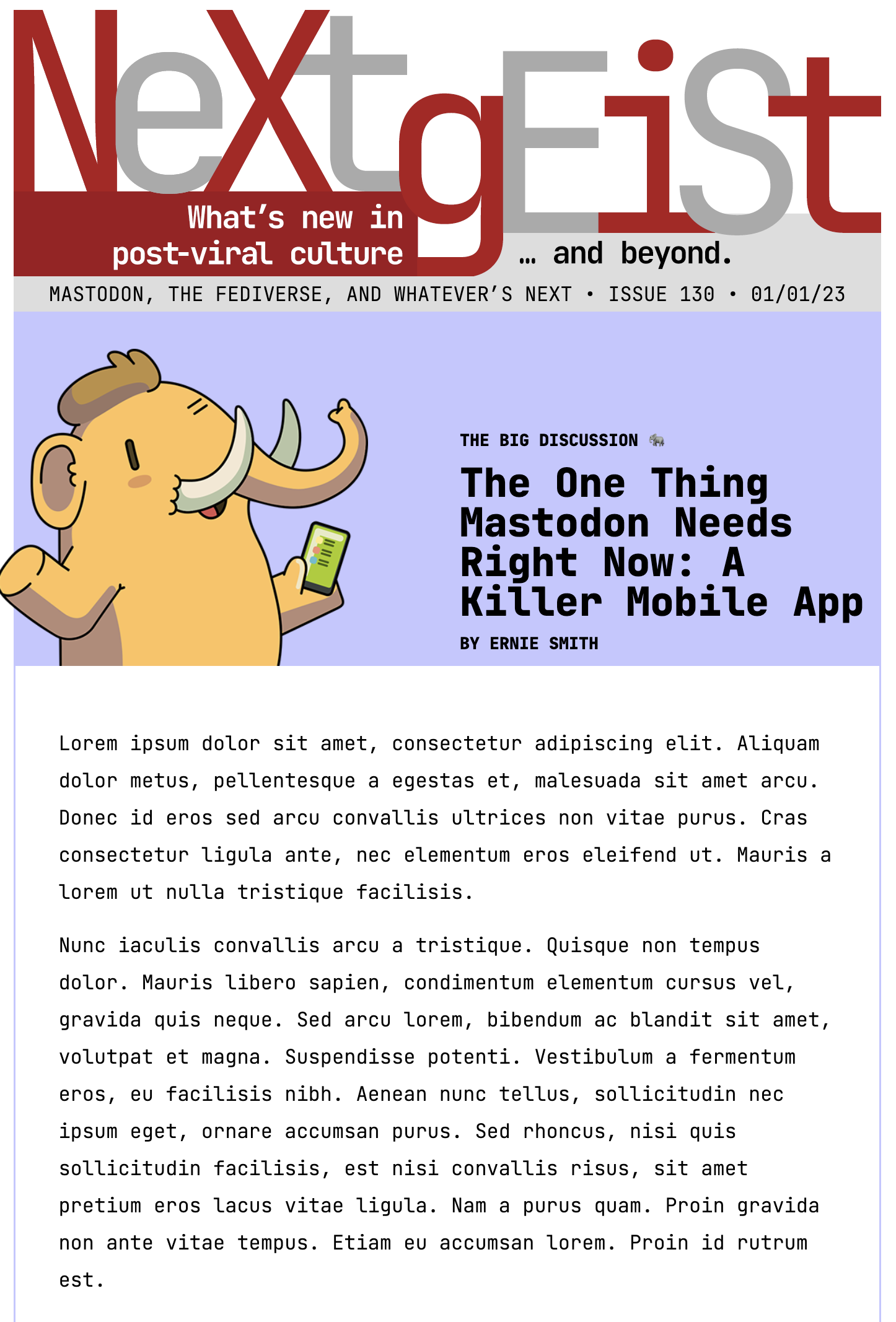
From an email standpoint, I am using my tool of choice, MJML, to build the basic template, which will integrate alt-story-form elements on top of a short discussion of longer issues. A sample design is shown above.
As far as when this will all run, the plan will be once a week, with some quick-hit updates on the web throughout the week, as necessary.
I am still debating the CMS approach. All my tooling at this time is on Craft CMS and I would like to keep that, but I would also like this site to launch with ActivityPub integrations, which Craft does not support at this time. So still debating.
My goal is to launch something sometime in February, with the MidRange list as the starting point. If you’re on the MidRange list, you will stay connected to NextGeist.
I hope that this brings something new to the discussion around social media, which feels like it’s at a real point of change, but one that seems to be harkening back to something older and more fundamental.
If I do my job right, perhaps NextGeist will capture the zeitgeist.
Time limit given ⏲: 30 minutes
Time left on clock ⏲: 28 seconds

