(Balázs Kétyi/Unsplash)
You know something that’s missing from most blogs? And editorial websites, even? Art direction.
If you think about a lot of websites built around content, they’re sort of built like machines of information that pull together disparate parts in consistent ways, ensuring that the results follow a general script: If this happens, it should look like this.
All the big ones are kind of like this, especially WordPress. It’s a framework, rather than a unique design for each article, as it might be in a magazine.
But recently, a Tedium reader, Steve Best, reached out about a separate topic (my old Mac Mini, if you have to know), and sent me an article he had written. I found the result super-impressive basically because he thought to do anything with design at all. Essentially, he didn’t do anything crazy with his prior site, called The Art Directed Journal, nor does he do anything wild with his current one, a self-titled blog. Both are built on Github.
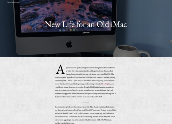
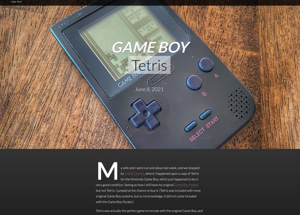

Just a few examples of the modest art direction Steve Best has been doing on his sites over the last couple of years.
But the secret sauce of each site is art direction. Every page looks a little different, and that little kick in the pants brings the pages new value.
This is something that has always been technically possible with CSS on websites, but nobody is doing it, and that’s a shame. Even my model with Tedium of creating a number of basic templated tools to allow for different visuals in the span of an average article doesn’t do anything like that.
It was so unusual that it stood out to me and made me wonder why other blogs don’t do this.
I think a big part of this is a result of the basic philosophies that took hold during the early part of the web—Jakob Nielsen was an important figure in the history of design online because he really leaned hard on this idea of convention, and books like Steve Krug’s Don’t Make Me Think pushed for convention in the name of simplicity.
This was all great in the early days of the web when people were designing pages with tables, but I sort of wonder if convention has been followed through to a fault, and is now doing more harm to the way we build content online than it does good.
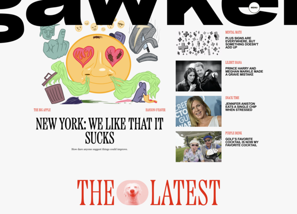
Some people don’t love this design.
I think, in this context, the recent Gawker redesign/reboot is worth bringing up. I’ve pretty publicly come out in favor of the visual work Bustle Digital has done with its different websites because it feels like it does more with the form than most other mainstream websites. But when broken down, it’s still a framework—a very unusual and ambitious framework, mind you, one that leads to weird and fascinating pieces like this, but still one that’s in service of the website, rather than the individual content pieces. But it does strike a nice balance when something needs to pop.
I come from a world of print design, where some of the best publications I worked on had very open formats like the current Gawker does, where every piece, given time and resources, can be art directed to some degree. And it’s really something creators on the web don’t do enough.
Is it the tools? Is it the weight of user expectations? Or is it just asking too much of individual creators to put a visual pop in every piece of content?
So I guess the reason why it stood out to me on a little Github site was because someone was actually sticking their neck out for art direction on an individual level.
When I saw what Steve was doing on a small scale, it honestly made me want to do something like that myself on a slightly larger one. Good thing I’m working on a redesign.
Time limit given ⏲: 30 minutes
Time left on clock ⏲: 2 minutes, 22 seconds

