(HalGatewood.com/Unsplash)
I’ve designed a lot of stuff over the years, and I always feel the need to continue tweaking the things I’ve built. It’s just my nature; when it comes to visuals, I’m kind of restless.
My old site, ShortFormBlog, went through at least four distinct redesigns throughout its five-and-a-half year history. The last design iteration, still on the Tumblr today, introduced a bunch of the ideas that I sort of played with on Tedium in terms of the approach to fonts and whitespace. (The second is still online on the ShortFormBlog archive site, which covers all of our WordPress posts. Yes, I still keep it online!)
But Tedium has not been quite as defined by redesigns. When the first version of the Tedium website went up in mid-2015, I stuck with it for more than three years, during the entire time I had been developing the site on Ghost. When I moved to the Craft CMS at the end of 2018, I built a fresh theme because I felt the layout had gotten too “heavy.”
The current layout now feels too “heavy” to me, and additionally, I feel a little nervous that my site loads too slowly for the Google Gods. So now I’m going back to do a fresh redesign with fewer graphical effects and less reliance on Javascript.
(Now, I have made smaller tweaks over the years—including at one point changing the body copy to sans-serif after a smattering of reader complaints, and building the box layout around rounded rectangles to match the visual look of the last newsletter redesign. But those aren’t really full redesigns.)
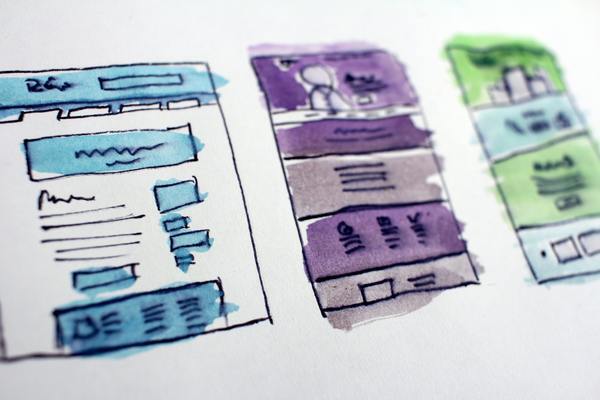
Here’s how it looks so far:
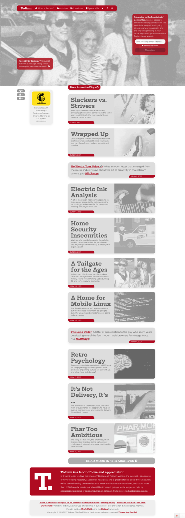
Here’s what the redesign looks like so far. (The bar on the left is sticky, and scrolls with your cursor.) I’m not one of those people who hides his efforts from the internet until he’s ready. I share my in-progress work.
When I built the last design, I decided that the driving concept behind the design was “living newspaper,” so I decided to experiment with different CSS effects to see how much I could get the site to look like newsprint. (I actually got pretty close!) And that was a useful thing to play with, but I think that I’ve played with that idea to the point where say I’ve done that and I need to do something else to catch readers’ eyes.
This time, I’m going for something a little more basic in the sales pitch: “Late 2000s blog revival.” I want it to feel like a current take on a site that you might have read in the latter half of the Technorati days, back when I started doing this, so the design will have a more methodical approach to listing content. It will, of course, be responsive.
Now, I don’t always turn these experiments into final designs. I once threw out an entire well-in-the-process redesign for ShortFormBlog because someone I respected, newspaper visual artist and today-in-history tweeter Charles Apple, suggested it wasn’t the right fit. But ultimately, a lot of this comes down to my own comfort level in terms of seeing what sticks and what makes the most sense.
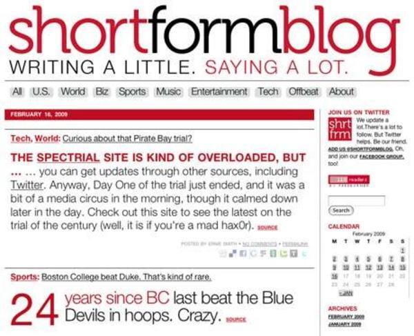
The first edition of the ShortFormBlog site, circa 2009.
But one thing that will likely not change: The basic color scheme. Back in late 2008 when I came up with the initial design for ShortFormBlog, I approached it with the idea of being black-and-white-and-read-all-over. So I chose a tomatoey/crimson-red color that has only changed modestly since that day. And while I’ve changed the fonts a few times (starting with Helvetica and, as web font technology improved, switching over to ChunkFive, then Nexa Slab, then straight Nexa, then the current mix of the open-source fonts Hepta Slab and Montserrat), I’ve always kept the same general approach—a dominant red color, mixed in with some grays and blacks, all on a white or off-white background.
Every design I’ve done since 2008 has relied on this formula in some way or another, and it has served me well. For better or for worse, you know what you get when you see an Ernie Smith website.
So yeah, I’m working on a redesign. I hope you’ll all like it.