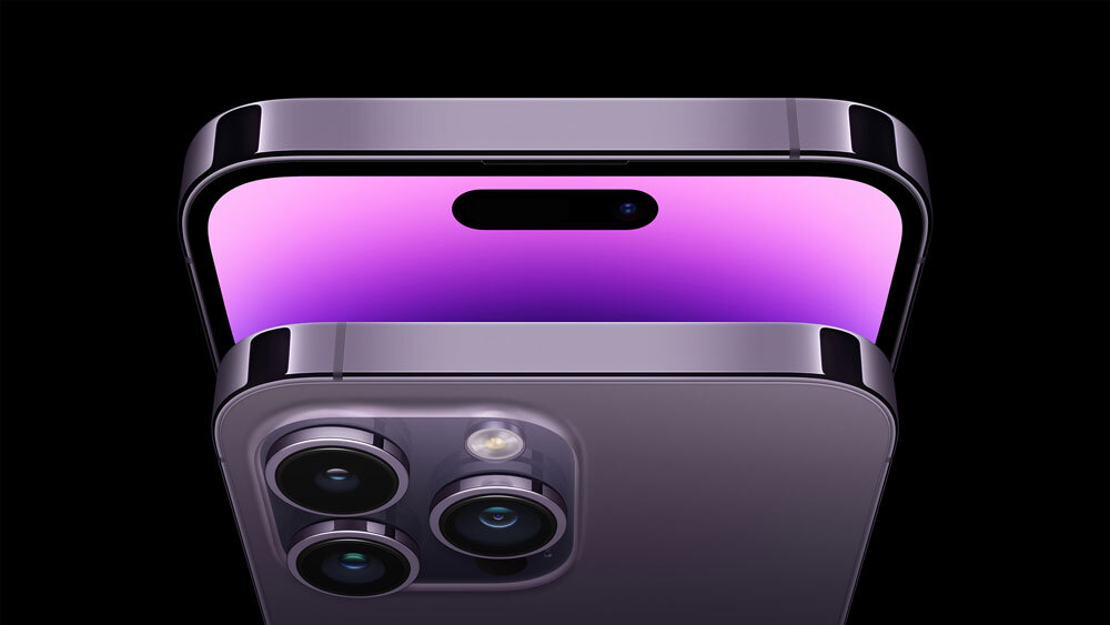
The largest hole cutout in the industry. (Apple)
Certainly, there’s no reason why Apple has to do things exactly the same way as any other phone maker. It is an island unto itself.
But I have to say, sometimes I sure wish the company toned the “Apple-ness” of some of its decision-making back. Not because they are bad decisions, but because those decisions seem to take the most complicated path to a solution.
There are plenty of examples of this in Apple’s history—we want a thinner laptop, so let’s make the keys so thin that they’re annoying to use and prone to damage—but the most recent such example feels a little on the counterproductive side of things.
With its latest round of smartphone releases, Apple has put its high-end phones on Dynamic Island—the unusual marketing term the company came up with to describe the large pill cutout the company is using for its Face ID mechanism. While the rest of the industry has taken to try to minimize the size of its notches and camera cutouts, Apple seems to have embraced the fact that it will always have one by making it a part of the design of the operating system.
The design works by leveraging the fact that OLED displays are purely black, making it possible to extend and shrink the pill as necessary. Essentially, this decision seems to suggest Apple isn’t interested in minimizing the real estate of its front-facing camera tech and is instead guessing that you’ll live with it.
This is a bet the company also made on the notch—but one nearly all of its competitors on the Android side have managed to already resolve more effectively. As far back as 2018, OnePlus had already cut down the size of the notch to a teardrop, then in 2019 put the camera inside a pop-up mechanism.
The reason Apple can’t resolve it is that the company made a bet on face recognition over in-screen fingerprint recognition. And while some people don’t like them (myself not included) the fact is fingerprint scanners do nearly all of the work of Face ID for practical purposes without taking away from the rest of the experience of using the phone. Watching a fullscreen video on an iPhone 14 Pro is going to suck in ways that it will not on a Samsung.
Getting back to Dynamic Island here: A lot of people seem to have fallen in love with the UX style, and why not? It’s not every day we get a new type of user experience on a smartphone, given the fact that they’re all mostly buttonless glass slabs. But to me, I think the real concern is going to be the distraction picture. We are already at a point where we already deal with too many notifications, and Apple has just given them a malleable, permanent place on their home screen. In an era where we’re already overwhelmed by notifications, it feels like a bit of a step back to add a visual noisemaker to the top of the screen at all times.
https://twitter.com/thurrott/status/1567580329367445504
(As for the name: I’m convinced Apple meant to call this thing the “Touch Bar,” as it is functionally similar to the Mac UX style in many ways, but that name had been smeared by years of mixed experiences on Mac keyboards. So they had to come up with another name, and it was a challenge. The real question: Does Apple bring back Dynamic Island to the Mac someday?)
I’m sure lots of people are going to love this design. But at a time when I try to keep my personal home screen very minimalist, it feels like a step in the wrong direction.
Maybe this is a sign that unlike half the U.S. population, I’m not really an iPhone guy, and it might take a while to get back there.
I’m a Dynamic Island unto myself.
Side note: This is issue number 250. That’s a lot of MidRange! Be sure to take a look at our archives to see what we’ve written in the past.
Time limit given ⏲: 30 minutes
Time left on clock ⏲: 4 minutes, 18 seconds


