(Matthew Feeny/Unsplash)
A number of years ago, I bought a book titled Grid Systems, a discussion on all things to do with design grids. I’ve had it for close to 20 years at this point. It’s the kind of book about design that holds up. One passage from the title, about the Rule of Thirds, a key grid concept:
An awareness of the law of thirds enables the designer to focus attention where it will most naturally occur and to control the compositional space. Elements do not need to land directly on the intersecting point as close proximity draws attention to them.
The writing is dry. The visuals are clinical, and half-transparent vellum pages appear occasionally to help underline points by overlaying grids on the designs being highlighted. The document is designed for the sake of reference, and honestly, if you’re going to spend money on a book like this, it’s probably exactly what you want. The way that author Kimberly Elam discusses this topic is just sort of beautiful in its own way. It’s up there, for me, with The Mac is Not a Typewriter as design books go.
I got it at a time when I was starting to find my wings as a designer, and embracing that my path into journalism, an industry I always wanted to be in, was print design. And it was. I worked in that field for years.
As lots of things have changed about the nature of design—where print became less relevant and the internet only grew in prominence—a lot of design elements have changed. But one thing that hasn’t is the grid. It is gospel. It makes it possible to make sure that your website’s visuals follow an underlying system.
(Halacious/Unsplash)
Or at least, I thought that was the case. But it turns out that there is a budding movement in web design away from grid-based systems, highlighted by Michelle Barker on her site about how awesome CSS is, CSS { In Real Life }. Barker’s points make lots of sense, even for someone who admittedly appreciates a good grid. Essentially, they break down to:
- Designers don’t think about the way that the grid shifts responsively, which creates more work for developers who have to account for complex viewpoints. “There is a collective failure to think of components in terms of behaviour—how layouts will respond to different types of content, and atypical viewport sizes—as opposed to fixed breakpoints,” she writes, adding that more communication is necessary between designers and developers.
- Grid systems in CSS frameworks have created problems with taking the easy way out when it comes to design, because they are oriented for grid systems. While more recent features of the CSS spec, such as CSS Grid, account for responsive design, these frameworks don’t take advantage of them. “Paradoxically, where CSS Grid shines is not only in building layouts that adhere to a strict design grid, but in baking flexibility into our components,” she writes. “But the temptation to choose the quick and easy solution, rather than the best one, is hard to resist.”
This post is just the thing that will force people who influence systems and design to think differently about the way that things are done now, just as blog posts and smaller-scale thinkers led to the creation of responsive design a decade ago. And Barker herself was inspired by a single-serving site, gridless.design, that makes the case that designers need to adapt their design styles to the web, away from the way the grid has previously worked.
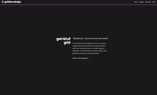
You don’t build a site like this if you’re not looking to start a conversation.
“No designer can prepare for all potential layouts,” creator Donnie D'Amato writes. “Instead, a seasoned designer should make decisions that inform what the parts of the layout should do if and when certain scenarios occur.”
This is some bold stuff—and I honestly am excited to see what comes of it. In recent years, I think a lot of web design has gotten a bit stale or challenged because it doesn’t play too much with the format. In many ways, this is a result of CSS not always being the easiest thing to work with (though it’s gotten much, much better in the past decade) and in part because frameworks like Bootstrap sort of discourage this kind of thinking.
But maybe now is the time to drop the old standby—to admit that maybe it’s holding us back from building better websites.
I’ll still keep my book about grids, though, because the concepts still matter even if the design strategy shifts.